6 Timeless Color Themes That Instantly Elevate Your Home Decor Year-Round
Choosing the right color palette can completely transform the look and feel of your home. Some trends fade quickly, but timeless color themes continue to look stylish, elegant, and welcoming no matter the season. The best part is that timeless colors are versatile enough to work in modern apartments, cozy family homes, luxury interiors, and minimalist spaces alike.
If you want a home that always feels fresh without constantly redecorating, selecting a year round color scheme is one of the smartest interior design decisions you can make. A timeless palette creates balance, improves mood, and gives every room a polished appearance that never feels outdated.
In this guide, you will discover six timeless color themes that instantly elevate your home decor year round. These combinations work beautifully in living rooms, bedrooms, kitchens, dining spaces, and even small apartments.
Table of Contents
1. Warm Beige and Soft White
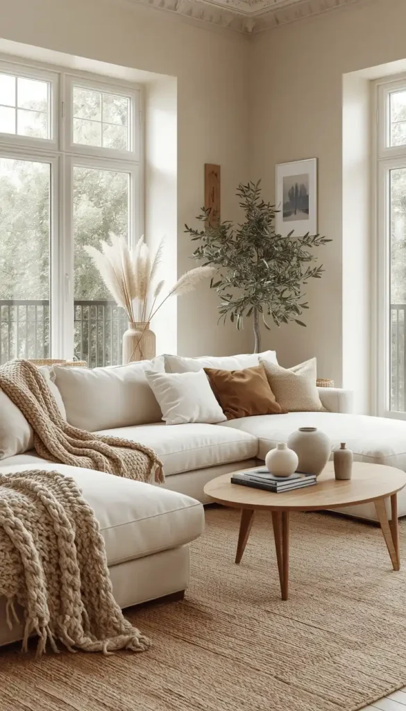
Why This Color Theme Works
Warm beige paired with soft white is one of the most timeless interior color combinations ever created. It brings warmth, brightness, and elegance into any room without feeling overpowering. Unlike stark white interiors that may feel cold, warm beige creates a cozy and inviting atmosphere.
This palette works exceptionally well because it reflects natural light beautifully while maintaining a calm and sophisticated appearance.
Best Rooms for This Palette
- Living rooms
- Bedrooms
- Open concept spaces
- Small apartments
- Scandinavian inspired interiors
Decor Tips
Use layered textures to make this neutral palette feel luxurious. Linen curtains, boucle chairs, woven baskets, and chunky knit throws add depth and comfort.
Wooden furniture in oak or walnut tones complements beige and white interiors perfectly. Add greenery through indoor plants for a fresh and natural touch.
Accent Colors That Pair Well
- Olive green
- Matte black
- Gold
- Terracotta
- Warm brown
Why Homeowners Love It
This color theme feels timeless because it creates a peaceful environment that works in every season. During summer, it feels airy and bright. In winter, it feels warm and cozy.
2. Sage Green and Cream
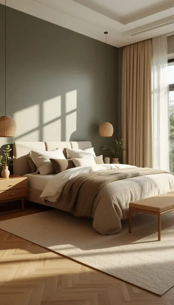
Why Sage Green Is Trending Yet Timeless
Sage green has become one of the most loved interior design colors because it brings nature indoors while still feeling elegant and calming. When paired with cream tones, it creates a relaxing and organic atmosphere that never feels trendy in a temporary way.
This palette works especially well for people who want subtle color without overwhelming a space.
Best Rooms for Sage Green
- Bedrooms
- Bathrooms
- Kitchens
- Reading corners
- Home offices
Decor Tips
Choose cream walls with sage green furniture or cabinetry for a balanced look. Natural materials like rattan, bamboo, and light wood elevate the earthy aesthetic.
Add layered lighting with warm bulbs to enhance the softness of the palette.
Best Materials for This Theme
- Linen
- Cotton
- Light oak wood
- Ceramic decor
- Stone accents
Why This Palette Feels Luxurious
Sage green creates a calming environment associated with wellness and relaxation. Combined with cream, the result feels sophisticated yet approachable.
It also blends beautifully with modern, farmhouse, Japandi, and rustic interiors.
3. Navy Blue and Crisp White
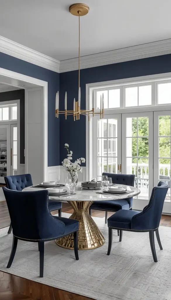
A Classic Combination That Never Fails
Navy blue and white is one of the most iconic timeless color themes in home decor. This pairing creates a clean, balanced, and upscale appearance that works beautifully throughout the year.
Navy adds depth and richness while white keeps the space feeling fresh and bright.
Best Places to Use Navy Blue
- Accent walls
- Kitchen cabinets
- Dining rooms
- Coastal interiors
- Modern living rooms
Decor Tips
Use navy strategically to avoid making a room feel dark. Pair navy furniture with white walls or white trim for balance.
Metal finishes like brass and gold add warmth and elegance to navy interiors.
Styling Ideas
- White sofas with navy pillows
- Navy kitchen islands
- Striped navy rugs
- Coastal inspired decor
- White curtains with dark blue accents
Why Designers Love This Palette
This color combination adapts effortlessly to every season. It feels crisp in summer and cozy in winter. Navy also photographs beautifully, making interiors look professionally designed.
4. Earthy Terracotta and Warm Taupe
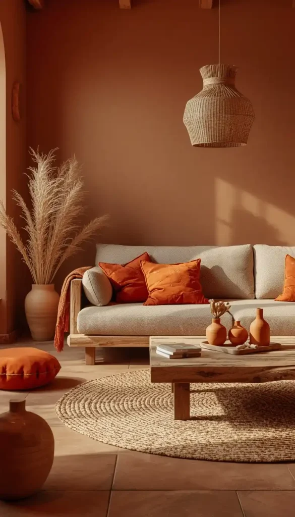
The Rise of Earth Inspired Interiors
Earth tones continue to dominate modern interior design because they create warmth, comfort, and connection to nature. Terracotta paired with warm taupe produces a grounded and welcoming atmosphere that feels stylish year after year.
This palette works especially well in homes that embrace natural textures and cozy aesthetics.
Best Rooms for Terracotta
- Living rooms
- Dining spaces
- Entryways
- Bohemian interiors
- Mediterranean inspired homes
Decor Tips
Terracotta can be introduced through accent walls, pillows, rugs, pottery, or upholstered furniture. Taupe walls create a neutral backdrop that keeps the space balanced.
Layer the room with warm lighting and textured fabrics for maximum coziness.
Perfect Complementary Materials
- Clay pottery
- Leather furniture
- Wooden decor
- Jute rugs
- Woven lighting fixtures
Why This Theme Works All Year
Earthy colors naturally create emotional warmth. In colder months, they feel cozy and comforting. During warmer seasons, they feel sun kissed and inviting.
This timeless palette adds personality without becoming visually overwhelming.
5. Charcoal Gray and Soft Wood Tones
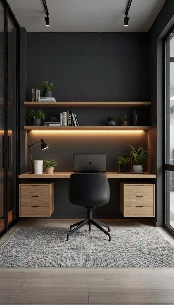
Modern Yet Timeless
Charcoal gray remains a favorite in interior design because it feels sophisticated, clean, and versatile. When paired with natural wood tones, the result is a balanced interior that feels modern without becoming cold or industrial.
This palette works in contemporary homes, minimalist interiors, and urban apartments.
Best Spaces for This Color Theme
- Modern living rooms
- Kitchens
- Home offices
- Loft apartments
- Masculine interiors
Decor Tips
Use charcoal gray on walls, sofas, or cabinetry while incorporating wooden furniture and flooring to soften the look.
Layer different shades of gray to add dimension and visual interest.
Accent Colors That Elevate This Palette
- White
- Tan
- Black
- Olive green
- Burnt orange
Why It Stays Stylish
Gray acts as a neutral foundation that allows furniture and decor to stand out. Natural wood keeps the palette warm and timeless rather than overly modern.
This combination also ages beautifully and works with changing decor trends.
6. Dusty Blue and Warm Ivory
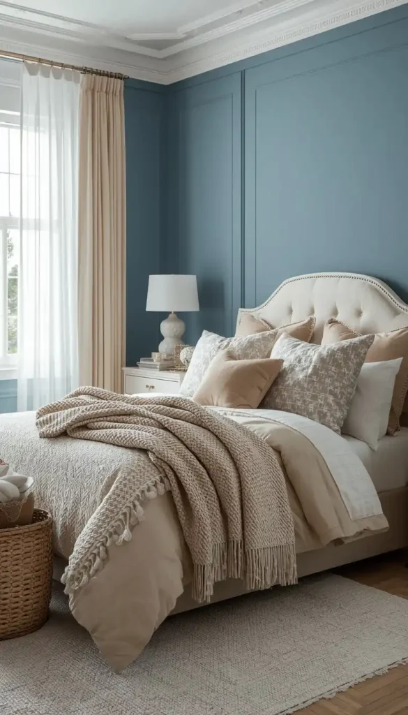
Soft Colors With Elegant Appeal
Dusty blue and warm ivory create a soothing, airy, and refined atmosphere. This timeless combination works especially well for homeowners who want subtle color with an elegant touch.
Dusty blue feels calming without being overly bold, while ivory softens the overall appearance.
Best Rooms for Dusty Blue
- Bedrooms
- Guest rooms
- Coastal interiors
- Nurseries
- Relaxing living spaces
Decor Tips
Use ivory as the primary base color and add dusty blue through textiles, furniture, or decorative accents.
Soft fabrics like velvet, linen, and cotton enhance the relaxing mood of the room.
Decor Styles That Match Perfectly
- Coastal decor
- Traditional interiors
- Cottage style homes
- Modern farmhouse spaces
- Transitional interiors
Why This Palette Is Perfect Year Round
This combination feels light and fresh during spring and summer while remaining cozy and elegant during fall and winter.
It creates a timeless atmosphere that never feels overwhelming or outdated.
How to Choose the Right Timeless Color Theme for Your Home
Selecting the perfect palette depends on your space, lighting, and personal style. Here are a few tips to help you decide.
Consider Natural Light
Rooms with plenty of sunlight can handle darker tones like navy or charcoal gray. Smaller spaces with limited light often benefit from softer palettes like beige and ivory.
Think About Mood
Colors influence emotions and energy levels.
- Warm tones feel cozy and inviting
- Cool tones feel calming and refreshing
- Earth tones feel grounded and relaxing
- Neutral palettes feel balanced and versatile
Use the 60 30 10 Rule
Interior designers often use this simple formula:
- 60 percent dominant color
- 30 percent secondary color
- 10 percent accent color
This creates a visually balanced room without overwhelming the space.
Add Texture for Depth
Even the most beautiful color palette can feel flat without texture. Combine fabrics, woods, metals, ceramics, and greenery to create a layered designer look.
Common Mistakes to Avoid When Choosing Home Color Themes
Following Short Term Trends
Trendy colors may look outdated quickly. Instead, choose timeless base colors and update smaller decor items seasonally.
Using Too Many Bold Colors
Too many strong colors can make a space feel chaotic. Stick to a cohesive palette with carefully selected accents.
Ignoring Lighting
Paint colors can look dramatically different depending on natural and artificial lighting. Always test paint samples before committing.
Forgetting Flow Between Rooms
A cohesive color story throughout the home creates a more luxurious and professionally designed appearance.
Final Thoughts
Timeless color themes make decorating easier, more elegant, and far less stressful. Instead of constantly chasing trends, you can create a home that always feels beautiful, welcoming, and stylish throughout every season.
Whether you love warm neutrals, calming greens, dramatic navy tones, earthy terracotta, modern charcoal, or soft dusty blues, these year round color palettes offer endless possibilities for creating a sophisticated home.
The key is choosing colors that reflect your personality while maintaining balance, comfort, and versatility. With the right palette, your home can feel timeless for years to come.
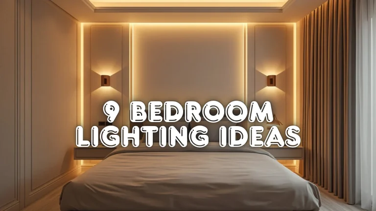
you may also like : 9 Bedroom Lighting Ideas That Make Your Room Look Expensive
Frequently Asked Questions
What is the best timeless color for home decor?
Neutral shades like beige, warm white, sage green, and navy blue are considered timeless because they work with many interior styles and remain elegant year after year.
How can I make my home color palette look more luxurious?
Use layered textures, quality lighting, natural materials, and balanced accent colors. Combining soft neutrals with wood, metal, or earthy tones instantly creates a more upscale appearance.
Which color themes make small rooms look bigger?
Light color palettes such as warm beige and soft white or dusty blue and ivory help reflect natural light, making smaller spaces feel brighter and more open.
Can timeless color themes still follow modern trends?
Yes. Timeless palettes provide a strong foundation while allowing you to update your decor with trendy accessories like pillows, artwork, rugs, and decorative accents without redesigning the entire room.